 ContentPowered.com
Infographics can be extremely good marketing tools. They can showcase a ton of good research or highlight the results from a unique case study you performed. They are also incredible graphic sources of traffic. They share very well on social media, they have access to infographic sharing sites and aggregators, and they’re often exceptional bases of guest posts.
On the other hand, good infographics can be very expensive. Depending on how much work you’re willing to do ahead of time, I’ve seen the cost of a good infographic range from $1,000 to $20,000. Obviously, the high end there is the kind of thing megabrands like Coke or Nike are going to spend, not the average small business, but the fact is: those brands are willing to pay that much for a good quality infographic.
If you’re operating on a small budget, you can get an infographic for under $500. The problem is, you run into a lot of the usual issues with quality. Let’s talk about it.
Cut Costs by Keeping it Simple
Infographics run a very wide range of possible levels of complexity. At the most basic level, you have infographics like this one:
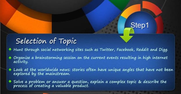
It’s basically just a blog post, split up into some PowerPoint slides, with the same graphic for each one. The amount of “graphic design” that went into it is minimal, and it’s really not all that interesting or compelling to look at. Another bad one looks like this:
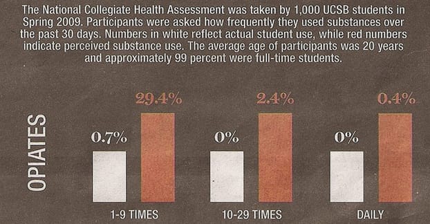
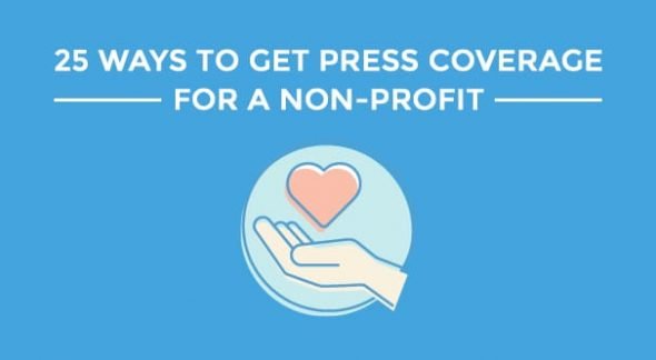
It’s just a pile of bar graphs with nothing really worthwhile to showcase. I wouldn’t pay more than $50 for either one of those graphics, and probably not even that; I could make them myself.
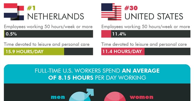
This one is another example of stats with some decent graphic design. The icons are at least relatively unique, so the graphic designer put a little effort into it:
This one has a similar level of graphic design, but I wouldn’t have been satisfied with it, myself. For one thing, a lot of the pink text is harder to read. For another, it’s positively compressed with the weight of all that’s crammed into it. It’s dauntingly cramped, and makes me not want to read it:

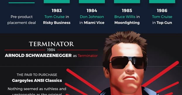
This is a better infographic. Your graphic designer needs to be pretty decent to turn movie stills into cartoons without making them look awful. It’s a well done graphic with a theme that fits the brand promoting it:
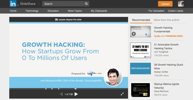
This one is also pretty good; it establishes an art style, flows information in a graphical way, and actually comes to conclusions rather than just presenting data:
On the extremely high end of complexity are graphics like this one. It takes a lot of complex artistry to make a 3D image of an engine, not just displayed, but animated. Animated infographics look really cool, but they’re also really expensive:

And, of course, you have the ultimate high end, which is “graphics” like this one, which are more interactive displays than infographics. I don’t count those as infographics, though; they aren’t something you can share and embed on other sites or on social media. They’re more like exhibits:
If you want a cheaper infographic, you have to temper your expectations. You aren’t likely to get a lot of complex or animated design for a low budget, but you want more than the basic grid of bar graphs if you want to stand out.
Cut Costs by Doing Your Research
A huge part of an infographic is the quality and volume of the information behind it. The more research you have, the better off you’ll be. In fact, I wouldn’t even begin putting an infographic together if I didn’t have a good source of data to use to fuel it.
High end professional infographic design, the most expensive coming from the best marketing firms, does it all for you. They take your idea, something like “I want to do an infographic about beverage preferences around the world,” and they do the research for you. They take your concept and turn it into an infographic. That’s why it’s so expensive; they need to conduct appropriate research and put it all together.
If you have the information on hand already, and all you need is graphic design, you’re going to be much better off. If you have access to the raw data, rather than just using the conclusions other companies have drawn in their blog posts, it’s that much better.
Speaking of conclusions, you want your infographic to have a point. The worst infographics are the ones that just present data without a conclusions. The best infographics are the ones that use that data to lead the reader to a conclusion, preferably an actionable one.
That won’t necessarily cut costs or anything, but it makes your design more worthwhile. The better your infographic is, the more value you’ll get out of the money you spend on it. A graphic designer doesn’t really care whether you have just data or data plus conclusions; they’ll charge the same either way. It’s the value you get out of sharing it later that makes the return on investment worthwhile.
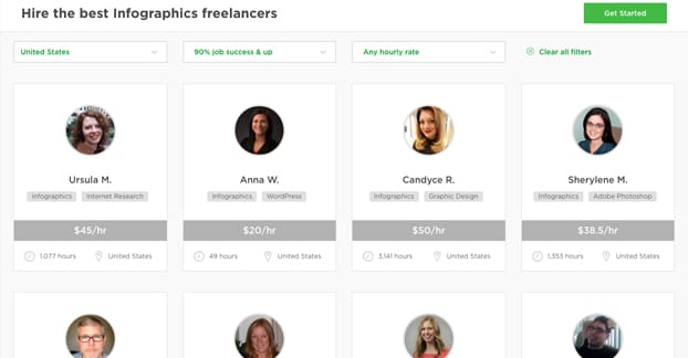
Find a High Quality Designer
So how are you going to find a designer that will work with you within your budget? You have a lot of options.
First of all, you can go for the bottom of the barrel sources. Here I’m talking about sites like Fiverr. Fiverr can get you some value in some ways, but compelling graphic design isn’t really one of them. Sure, you can get a decent graphic for under $100, but it’s not going to stand out, and it might have artwork, a template, or a style that is clearly recognizable and obviously not your own.
You can find design firms like Only Infographics, which charges around $400 for their cheapest, smallest infographics. They’re very good design, but also quite small; if you want a larger graphic, you’ll stretch beyond your cap of $500.
You can use design contest sites like Design Hill with their lowest tier package. You pitch your idea and get ~20 designers to submit designs for you to pick from, and have to pick one of those designs. That will run you a bit under $300, but you run the risk of nothing quite working.
You can also look for designers on freelance portals. Graphic design on Upwork has a lot of different freelancers willing to work with you, for prices that range from $35 an hour to $125 an hour. You’ll obviously want to talk to the freelancer in question about your budget and their projected rates. Remember, the more information and the better a design pitch you can come to them with, the less work they will have to put in, so the less time it will take them and the less you’ll have to pay.
You can also look for local designers. You might not be able to afford whatever private designer has their office downtown, but if you have a local college with a graphic design program, you can talk to a professor and ask for them to give your information to a promising student. Students often leap at the chance for some paid work, and you can potentially build that relationship up with repeated work over the years. Who knows, maybe they’d turn out to be a great employee once they graduate.
Opt For a DIY Approach
If you really want to save as much money as possible, you can go and do the graphic design work yourself. You might not be a graphic designer, but there are some tools that can help you make something that at least looks decent. Plus, if you ARE a graphic designer, you can use those tools to great effect and make a graphic that looks exceptional.
One benefit to using a tool is that they’re often cheap or free to use. This means the majority of your $500 budget can go towards other elements of your infographic. You can hire someone to do the case study or research for you, or you can hire a writer to create the articles that will surround it when you post it and attempt to guest post with it.
What tools might you use? There are a few options.
- Canva is generally my go-to recommendation. They have some basic templates for infographics that you can adapt using their huge library of stock photos and graphic elements. Some of those elements are free, while others require payment when you go to export the finished graphic. On the plus side, you only pay for what you use, so you can mock up a bunch of different designs and only pay for the one you actually use.
- Piktochart is a very similar option that gives you access to their asset library for free, but charges you for an account if you want some advanced features, like element uploading, watermark removal, custom color schemes, and PDF exporting.
- Venngage is also free, if you’re okay with having a branded infographic. Otherwise it’s a monthly fee to use the tool. It’s pretty limited, but it’s an option if you don’t like the others.
And, of course, you can just use something like PhotoShop to make your own from scratch, if you’re trained in the use of the software and know what you’re doing with regards to asset and image rights. Don’t go stealing images to use in your graphic if you don’t have the rights to use the image.
Repurpose Your Data for Multiple Channels
I mentioned it a bit above, but one other way you can reduce the overall cost of an infographic is to get more value out of it. You won’t be paying less, but you’ll be getting more in return, so when you calculate the cost per new visitor or new conversion, it works out better in your favor.
To this end, you want to use the infographic and associated data as well as you possibly can. Get your infographic created and write a blog post for your own site about it. Submit pitches to guest post with it – you can get three or four guest posts just off the uniqueness of the graphic, many times – and write unique blog posts for each.
You can also chop up the infographic and expand upon it, making a slide deck or even a slideshow-style video for posting on YouTube and Facebook. You can post the data in a PDF ebook that requires an opt-in to download, if it’s unique data that others might want to access. You can convert one of your blog posts into a podcast, even, though podcasts aren’t the powerhouse marketing tool they once were.
At the end of the day, virtually all of the way you have to cut the cost of your infographic involve investing the time yourself. After all, that’s the purpose of outsourcing; spend money to save time. If you want to save money, you have to spend the time. If you’re willing to do so, or have the employees you can assign to do so, you can get a great infographic for under $500. If not, well, you might want to come back with a higher budget or more time on your hands.

